
UX Research
Research Strategy
Myself, 3 UX Researchers &
UX Manager
2 Weeks
User Journey
Usability Testing
Competitor Analysis
UX Audit
Qualitative Testing
Usability Heuristics
MoSCoW Analysis

In the evaluation for RBL Bank, we aim to identify usability issues and opportunities for improvement within their online banking portals, mobile banking applications for both consumer(B2C), and corporate (B2B) customers. This evaluation process thoroughly examined the interfaces, noting any inconsistencies, navigation challenges, design flaws, or accessibility barriers that may impact the user experience.
The findings from the evaluation inform the banking client about areas where their digital banking platforms can be enhanced to better meet user needs, improve user satisfaction, and ensure compliance with industry standards and regulations. Ultimately, heuristic evaluation serves as a valuable tool for guiding design decisions, optimizing usability, and enhancing the overall user experience of banking services in the digital realm.
The NCPI framework breaks down a user interface
NAVIGATION
Can users find it?
CONTENT
Is it what the users want?
PRESENTATION
Is it easy to Comprehend?
INTERACTION
Can users act on it?
The VIMM framework evaluates the user effort.
VISUAL
Reduce visual clutter
INTELLECT
Minimize complex navigation
MEMORY
Recall over recognition
MOTOR
Complex/frequent physical movements

Desk Research
Stakeholder Interview

User Persona
User Journey

Usability Testing
Competitive Analysis
Desk Research
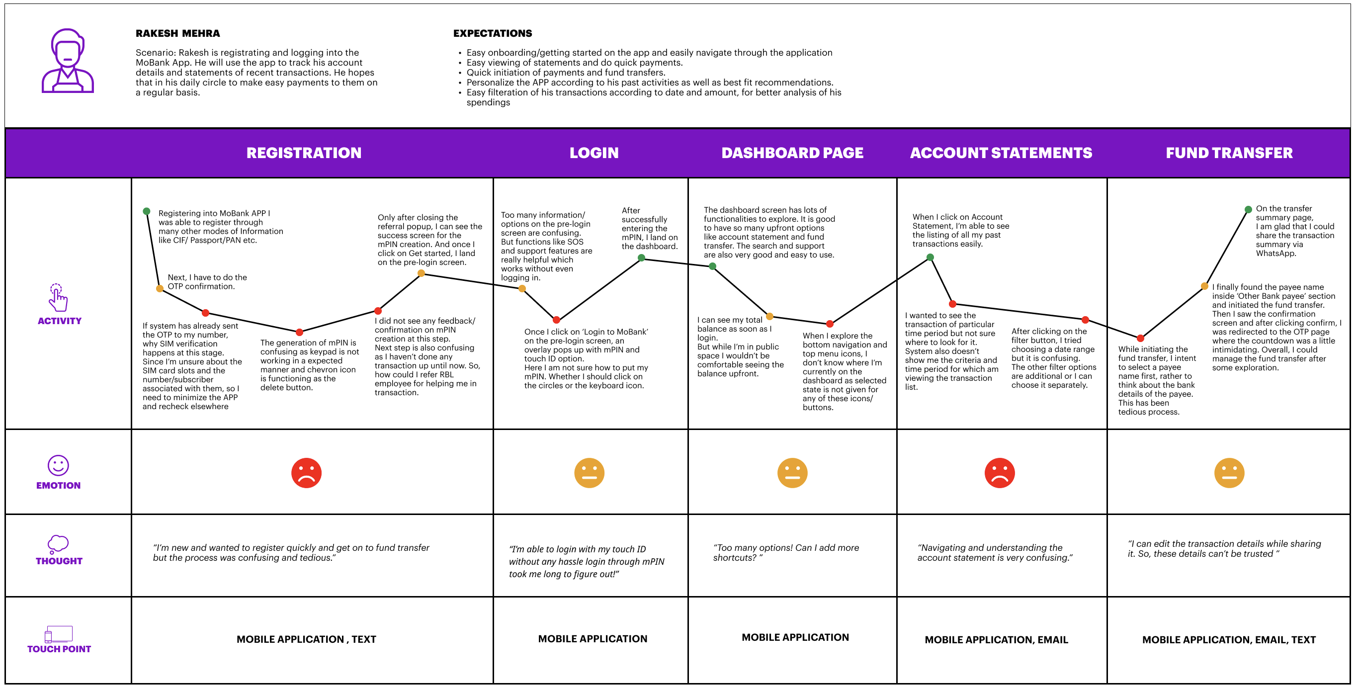
As a team, a set of user journeys were supposed to be evaluated.
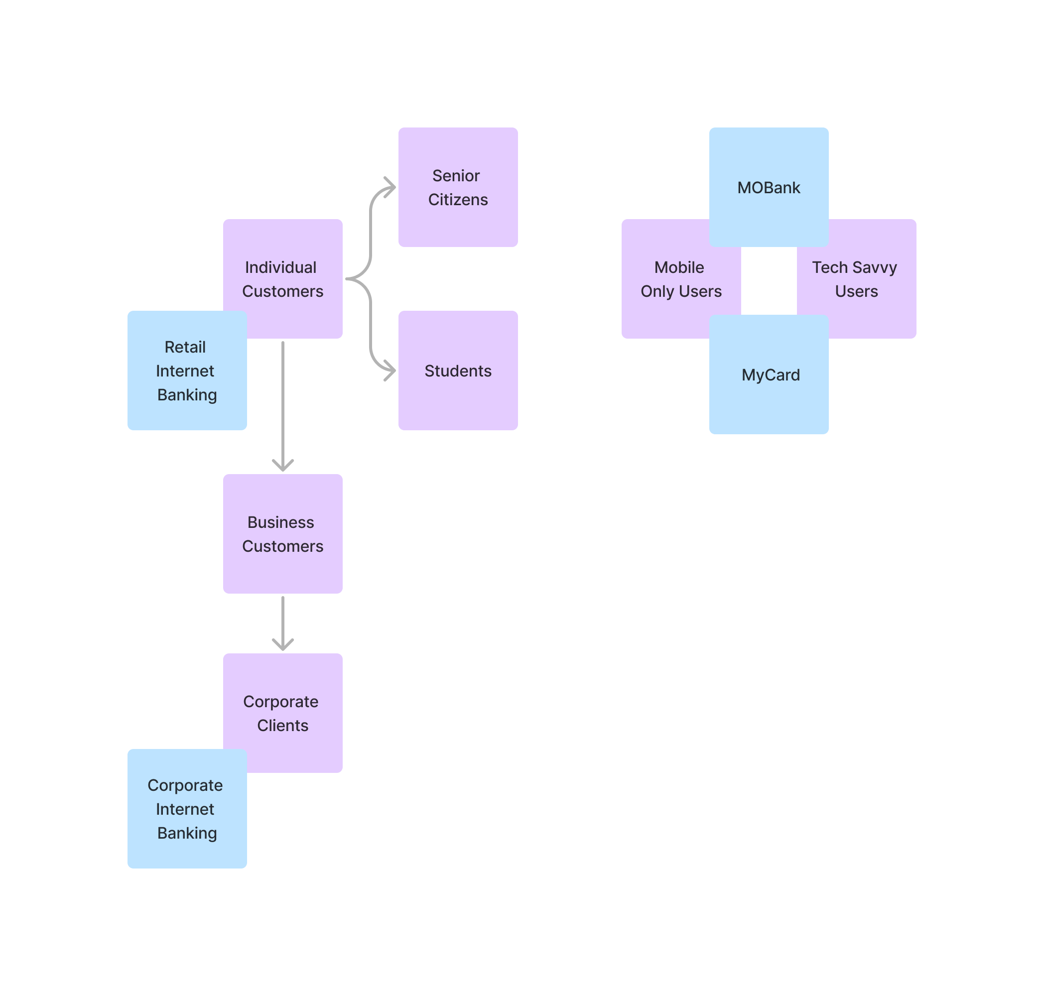
Blue sticky notes indicate the application (web or app)
Other sticky notes indicate the scope
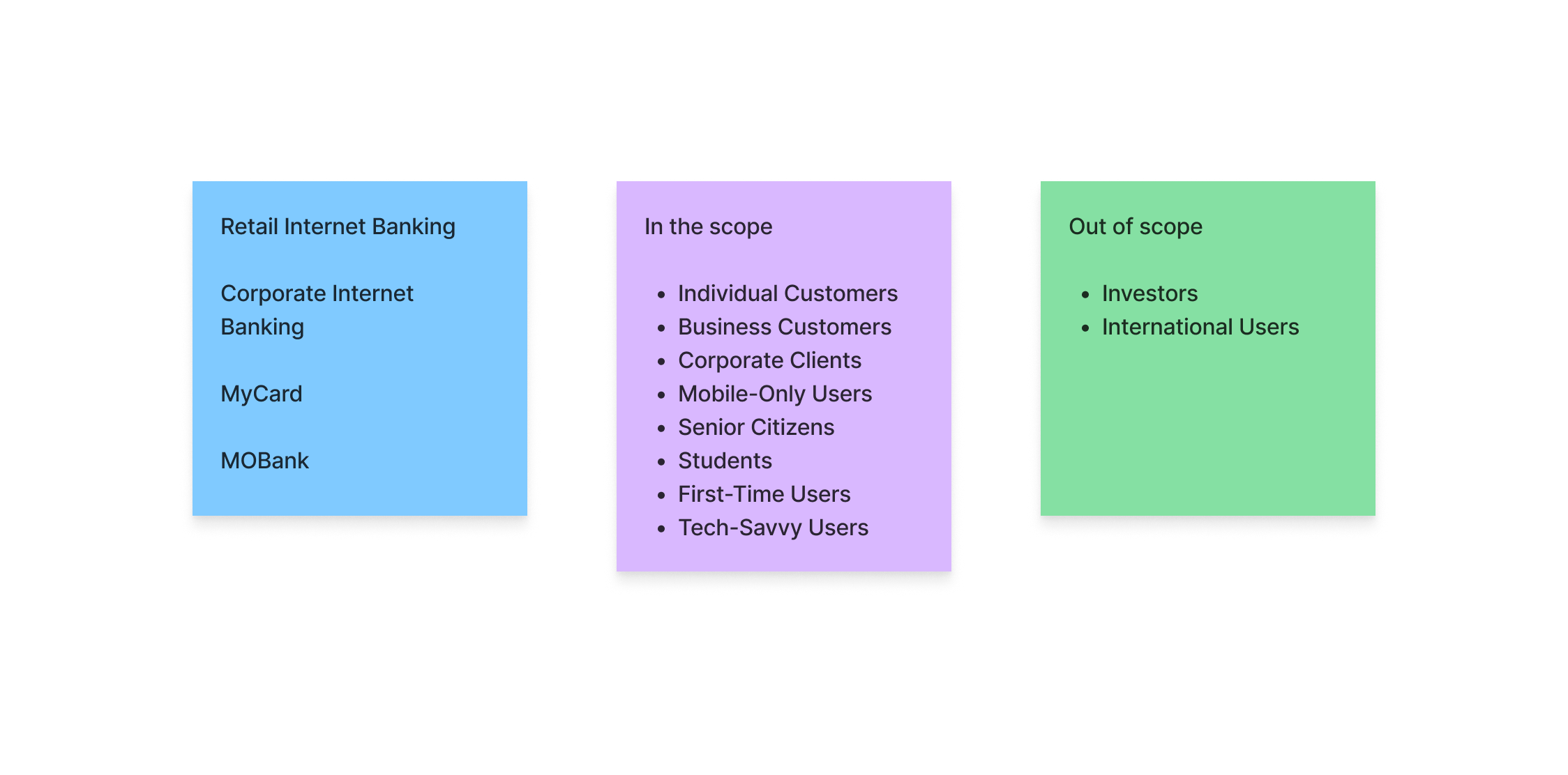
The User Journeys were appropriately mapped with different types of customers and users.
The stakeholder interviews were conducted to gather insights on task performance and to understand the overall UX maturity of the organization, structure the user journeys to be assessed, and address any specific concerns stakeholders had regarding UX design and user experience.
Understanding UX Maturity:
Stakeholders were asked about the organization’s approach to UX design and how user-centered practices are integrated into their processes. This included discussions on past UX initiatives, investments in UX, and the perceived importance of UX within the company.
They provided insights into the current state of UX maturity in the organization. Emphasized the level of collaboration between UX/UI teams, product teams, and other departments, as well as the challenges faced in implementing UX improvements.
The interviews also explored any barriers or resistance encountered in adopting UX practices, giving a clearer picture of the organization’s readiness to embrace UX enhancements
Structuring the User Journey:
Stakeholders were engaged in discussions to identify the most critical user journeys for both retail and corporate customers. These are the workflows that have the most significant impact on user satisfaction and business outcomes.
The interviews involved mapping out the user journeys in detail, including key touchpoints, decision points, and potential pain points. Stakeholders provided valuable input on which areas of the journey were functioning well and which required attention.
Stakeholders were encouraged to share any data or insights they had about user behavior and pain points along the journey, which helped in identifying specific areas for improvement.
The insights gained from these comprehensive stakeholder interviews played a crucial role in shaping the overall UX audit. They informed the identification of critical user journeys, highlighted areas for improvement, and ensured that the audit addressed the organization’s unique challenges and maturity level.
Based on the above methods, the data gathered was mapped into a user persona to understand better the users we are trying to cater to.
MoBank mobile application
Corporate Internet Banking
User journey directed the task scenario we should be observing for usability testing.
For the MoBank mobile application, we observed the following tasks:
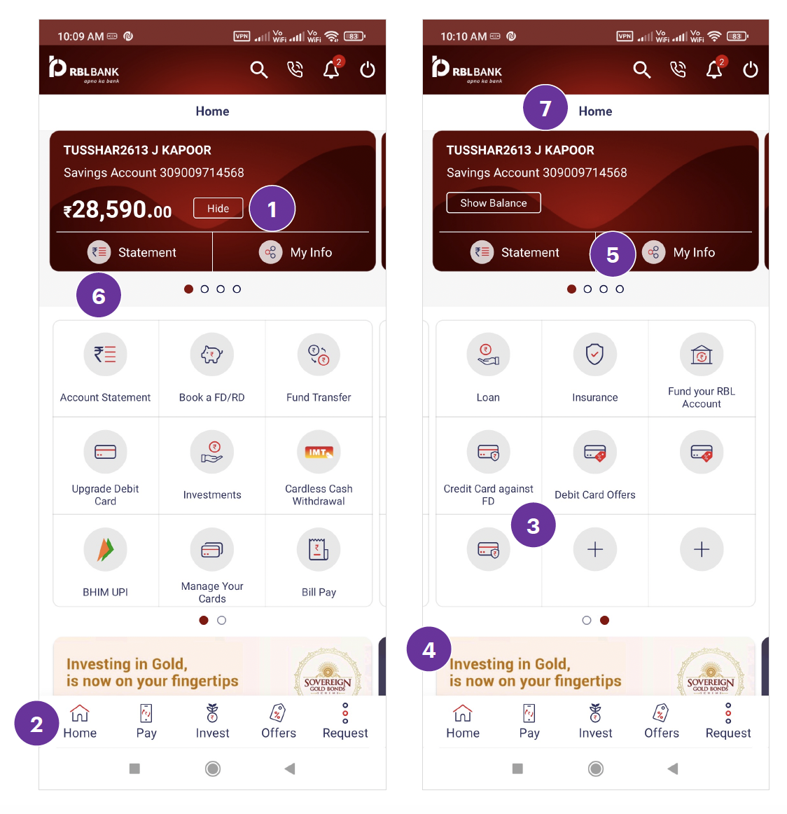
Observation of Dashboard task
Home Screen
There is no selected state for the bottom navigation.
The icons used in the grid are inconsistent in style and size. Also. ‘+’ icon looks clickable to add more features/functionalities by the user.
Users will not know bottom banners are Carousal as the ‘dots signifier’ is missing.
The icon next to ‘my info’ looks like a 'share' icon.
Repetition of content. Like, ‘Statement’ functionality in the card and ‘Account statement’ functionality in the grid serve the same purpose. Multiple tabs for payment in the grid (FT, bill pay, etc.)
User is already on the homepage. Showing ‘Home’ header doesn’t make sense.
Icons in the top navigation bar
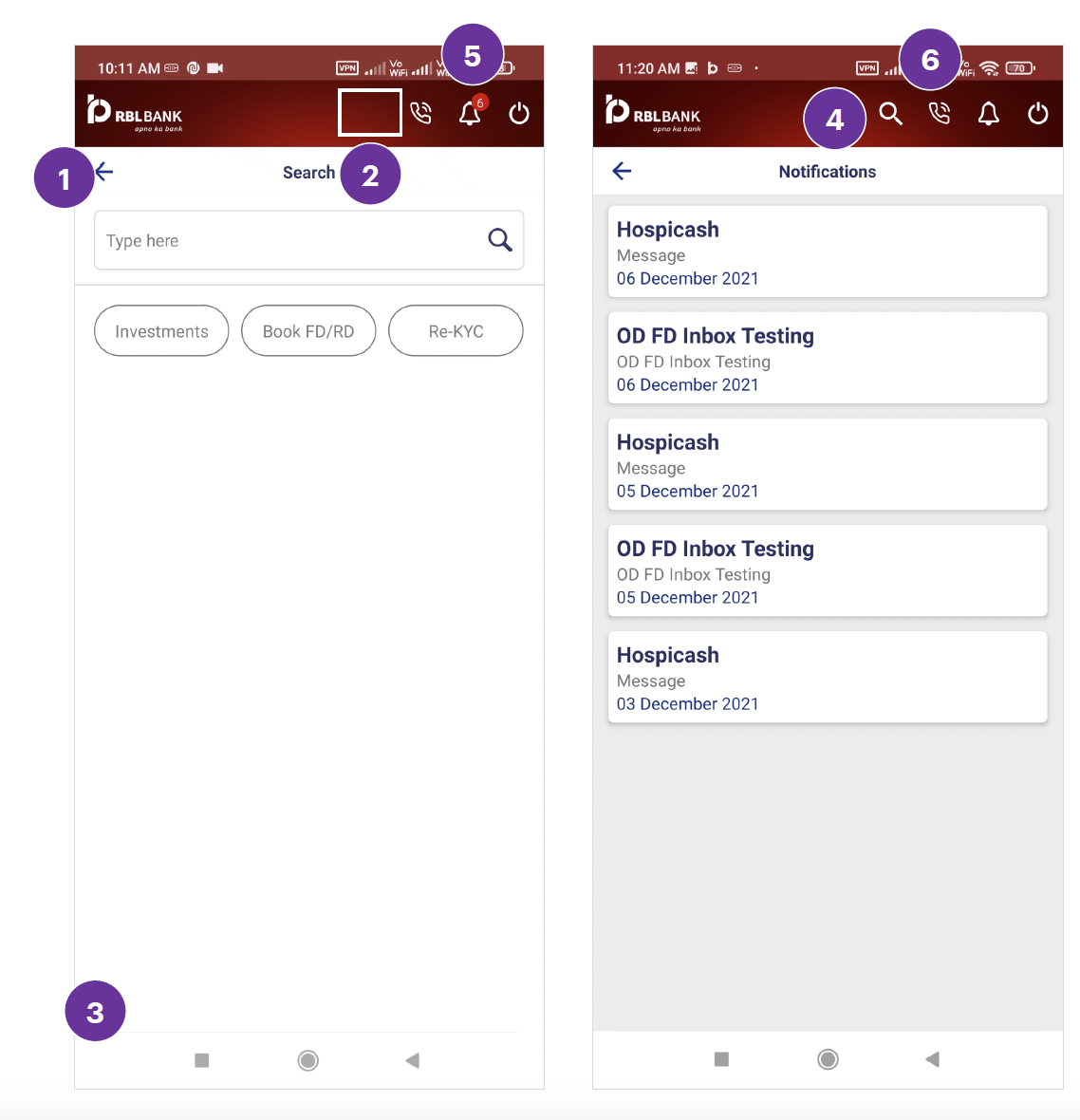
Bottom Navigations
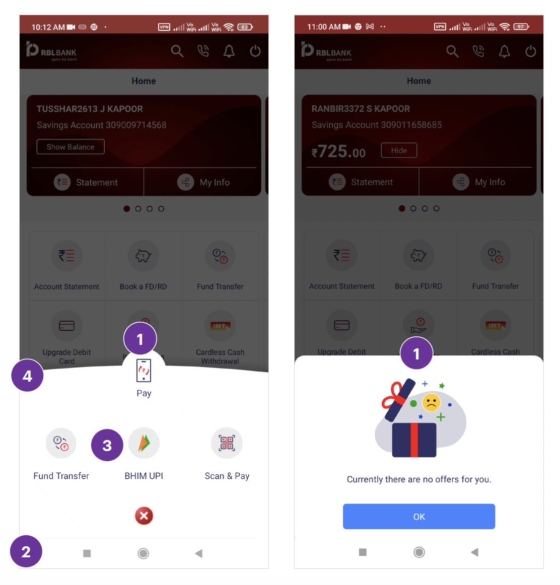
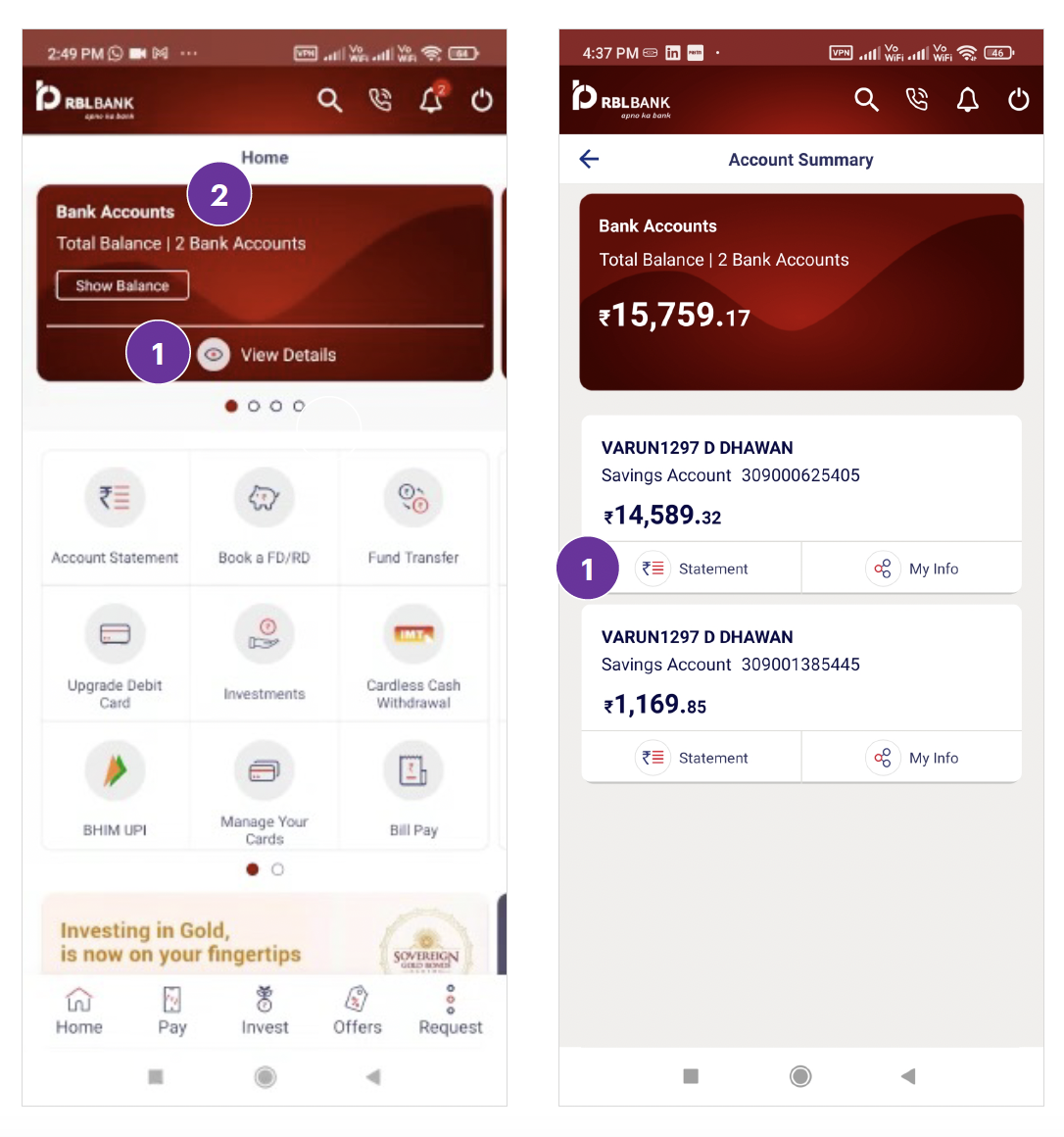
Multiple Accounts
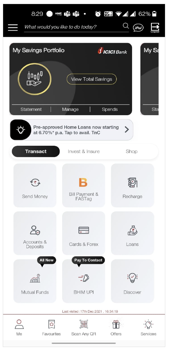
• Amount is in a hidden state after logging in.
• Services are grouped under 3 easily recognizable categories i.e., 'Transact, Invest & Insure, and Shop'.
• All the main action is easily noticeable at first glance.
• Subtle way to place banner without suppressing main action items. Users can easily notice the banner.
• Card swipe is easily noticeable, even without carousel dots.
• Consistent visual design.
• No vertical scroll is required. All the components fit inside the screen.
• Hide CTA loses its purpose if the amount is visible at the first glance after logging in.
• Services are not grouped properly, and the hierarchy of functionalities is confusing.
• No selected state for the bottom navigation.
• The bottom banner can be easily missed. A vertical scroll is required to see the bottom banner.
• Inconsistent card design for single accounts and multiple accounts. When multiple account is added ‘Statement’ and ‘My info’ CTAs get replaced with ‘View Details’ CTA.
• Icons used in the grid are inconsistent in style and size.
• User is already on the homepage. Showing the ‘Home’ header doesn’t make sense.
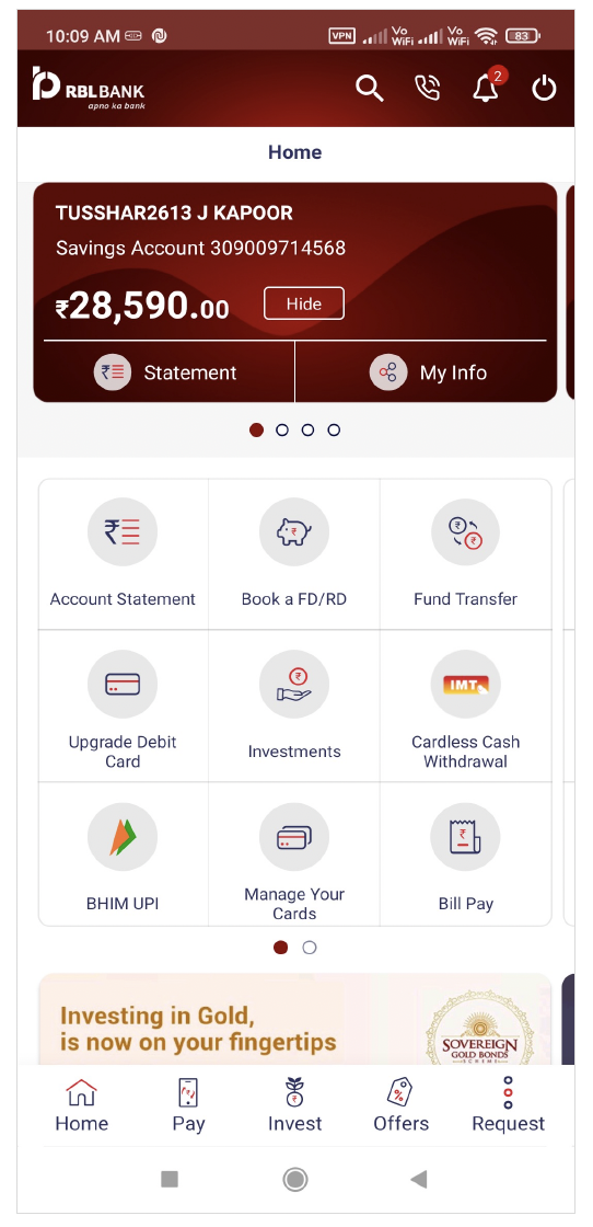
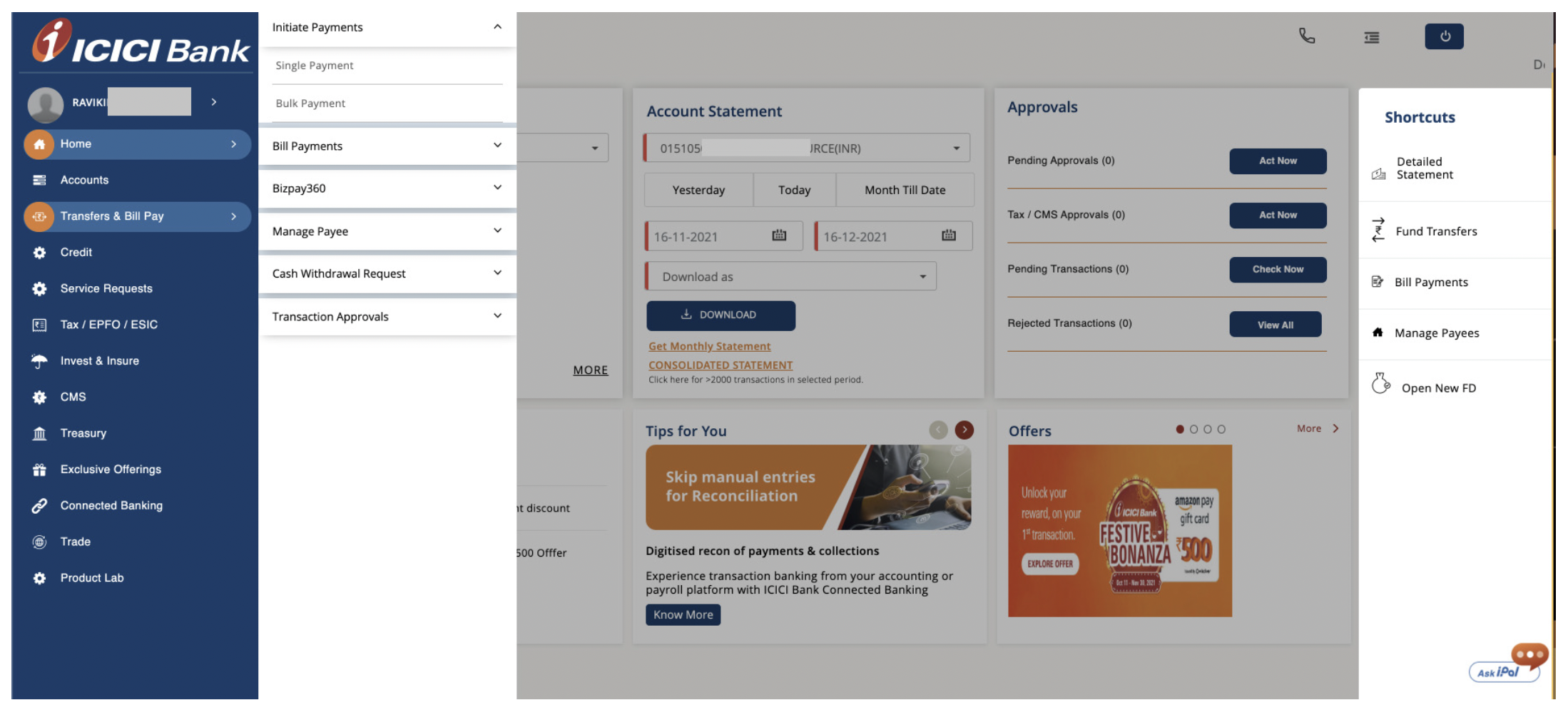
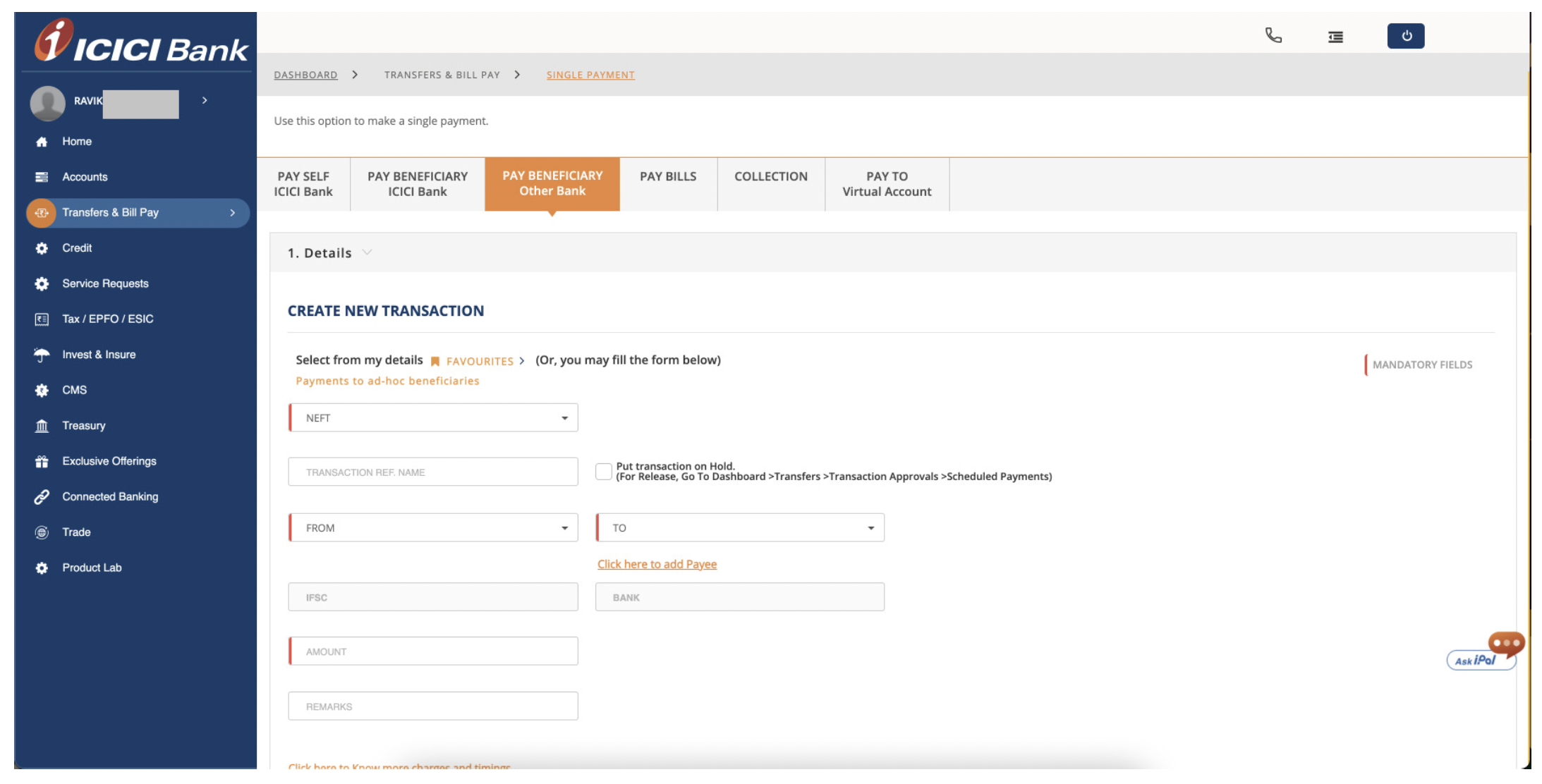
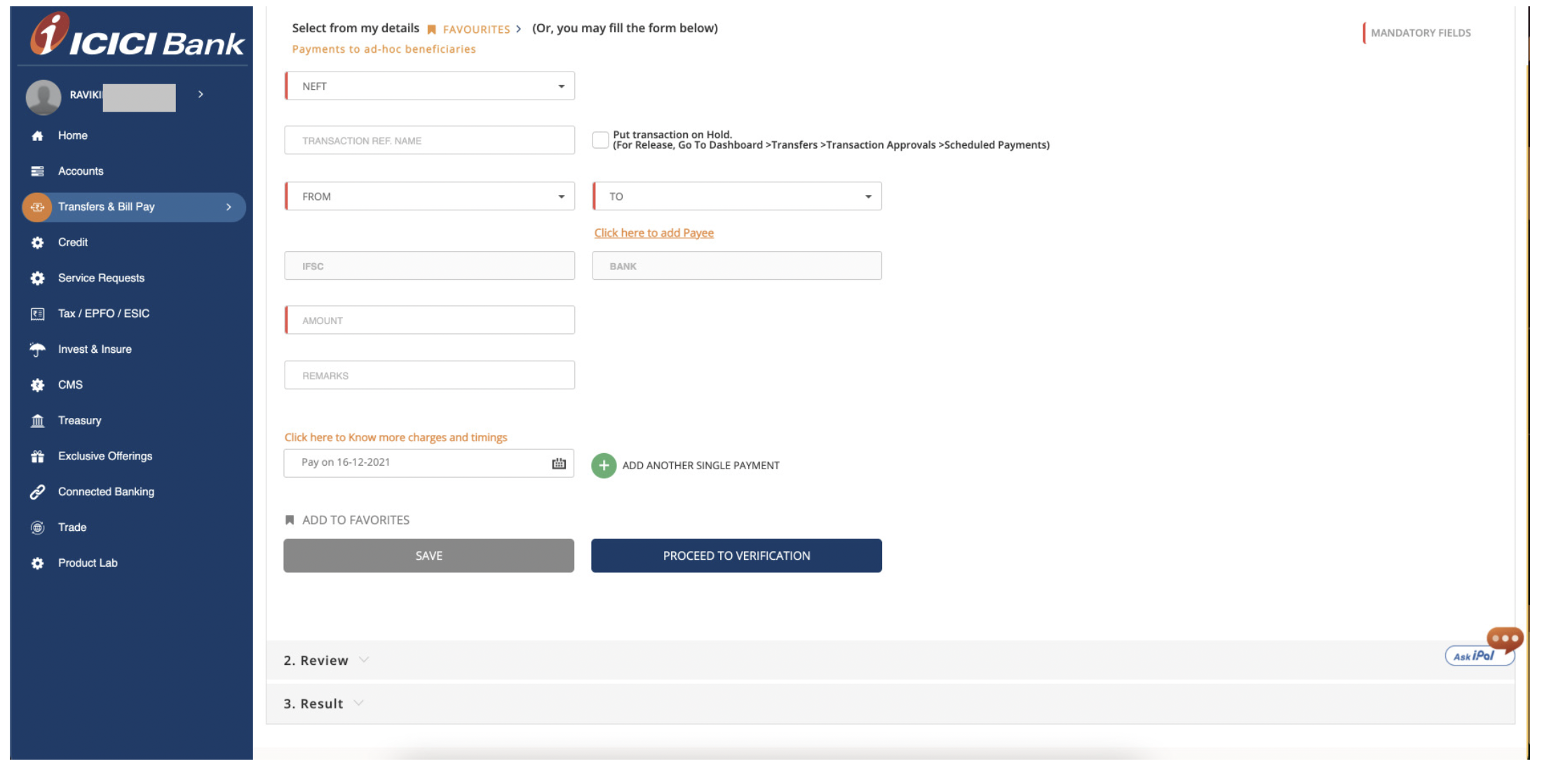
For the Corporate Internet Banking website application, we observed the following tasks:
Bank Transfer - other account
Payment Journey
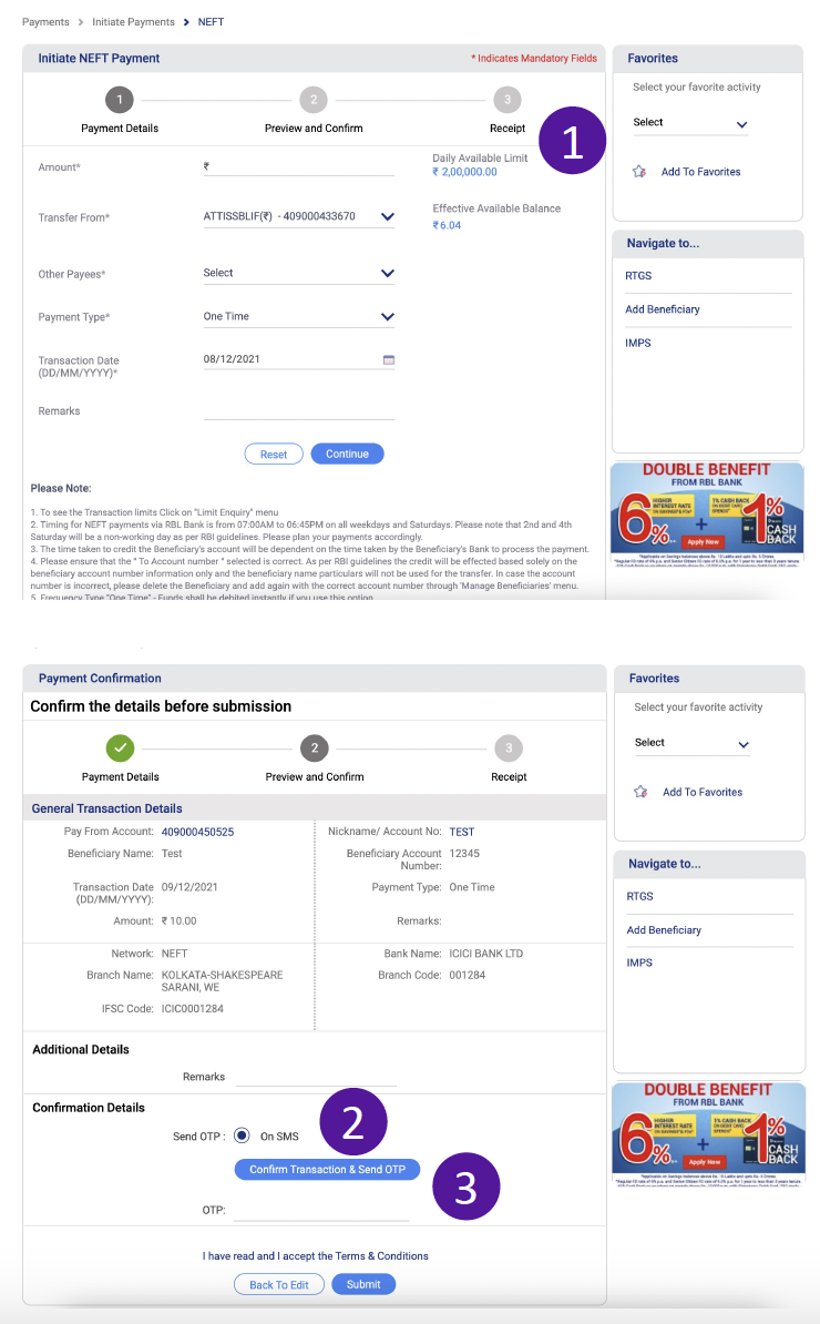
Daily Available Limit: The user might get confused between the daily available limit and Effective Available Balance. The hierarchy can cause motor load for the user.
Send OTP: There is only one option for OTP which is SMS. The Radio button is redundant.
Enter OTP: There is no OTP to enter unless the user clicks on ‘Confirm Transaction & Send OTP’. The OTP field below is redundant in this case.
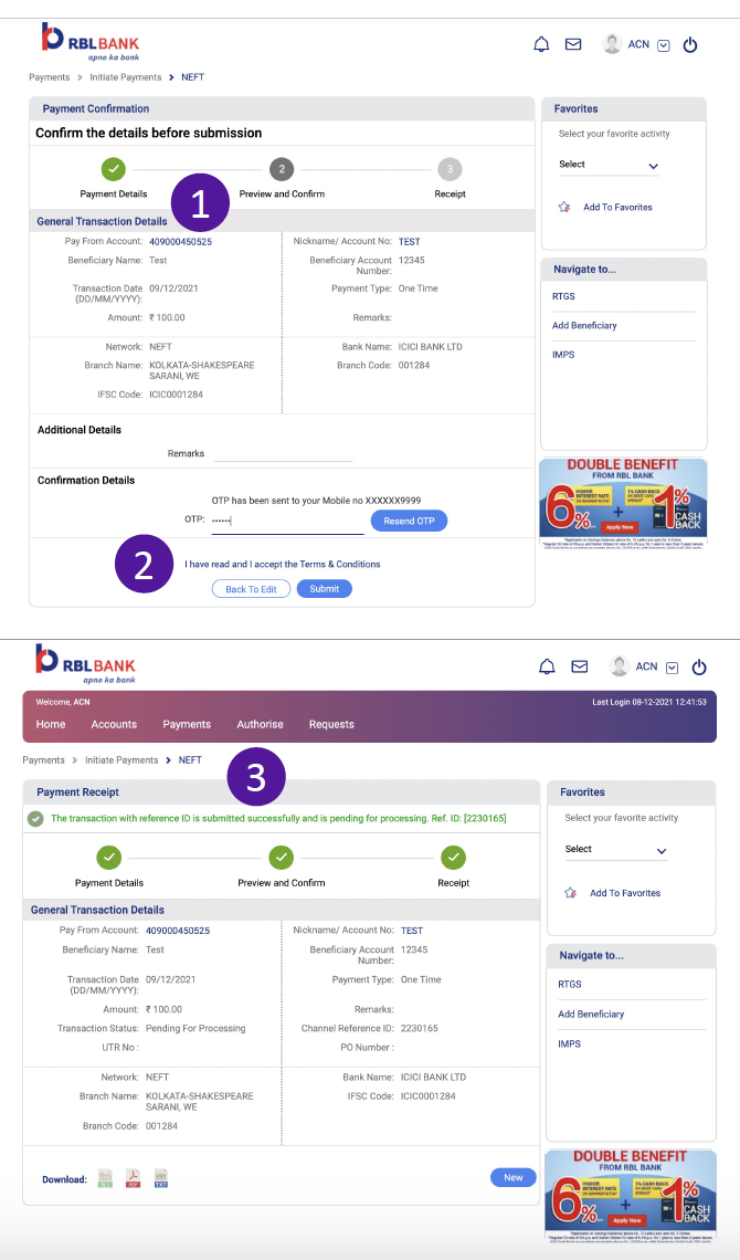
Payment Acknowledgment
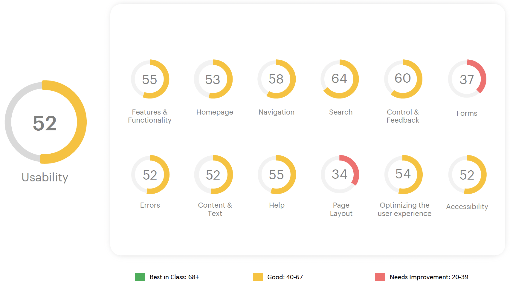
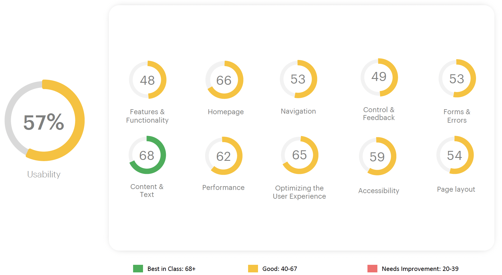
Overall Experience Scorecard
MoBank mobile application
Corporate Internet Banking
Humanizing technology, one pixel at a time.
Connect with Ikshita
